Of hockey and fashion.
A while back, the NHL announced that they were partnering with actress Alyssa Milano to create the hockey version of her women's clothing line full of frilled up, rhinestone-studded, "trendy" shirts, formerly featuring the logos of various MLB teams. Don't get me wrong, they were hardly all absolutely awful - but they weren't all good, either. When the idea of an NHL-based line came up, there were a few prototypes through out into the mix - a handful of 3/4 sleeve shirts emblazoned with the All Star Game logo, a girly red something and a more ice-rink-inclined vest (thanks Tracy for making that post!) but not much more. Certainly not on the scale of the MLB designs. And then the project seemed to fade away.
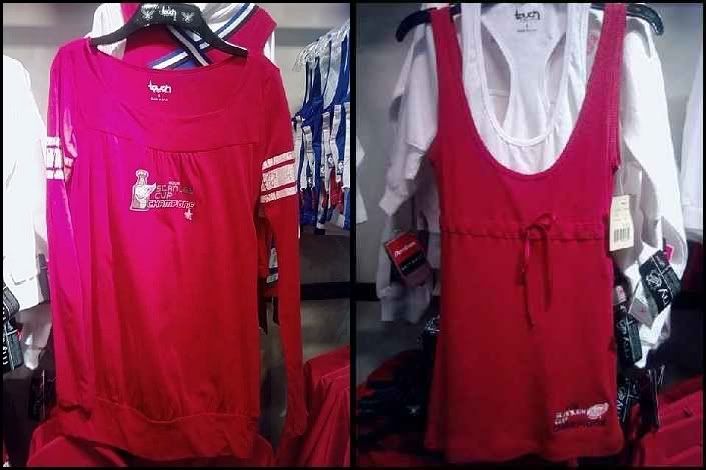
Until yesterday when I stepped into a new store at Lakeside Mall called "The Hook Up", specializing in sports apparel, knick-knacks, etc. I was checking out the Wings Cup Champions merchandise when I saw these:

Both (excuse the poor quality cell phone pictures) feature a small (although at least centered, in one) Wings logo and proclaims them the "Stanley Cup Champions" - which must make the logo a heck of a lot harder to work into the intended "cute" designs. The one on the right, like the earlier vest, seems at least like decent rink-wear, for those ladies who don't get cold too easily.
Apparently the NHL "Touch" line isn't dead after all - and in fact wants you to know exactly who won the Stanley Cup this year. Personally I (like Tracy) would think that winning the Cup especially would result in wanting the logo to be as big, obnoxious, and proud as possible, but these are far from as bad as (upon further investigation) they could be. And oh can they be. It seems a little odd that the NHLNHL seems to be at such a distance from the whole business though - even the Wings' online store features only a couple of the "Touch" designs - and none of the Cup Champs ones.
Thoughts? Opinions? Pitchforks? Obligatory Milano is hot comments?


5 comments:
If that's the best that the NHL can do for women's fashion, I'd do what all those baseball players did and walk away from Milano.
Is that thing on the right a tank top? Seems very ill fitting for a tank top...
I don't know, these things look poorly made and not very attractive. I just don't understand why they can't use some of the simple designs they have for men and kids and convert them to womens sizes.
Teebz: Agreed! With designs like that it's really no wonder the NHL seems to want nothing to do with promoting the line.
Kms: It looked sort of like two 'wifebeater' style tanktops layered on top of one another - but you're very right about the poorly made thing. The material on both was extremely thin and cheap looking and the logos weren't even very well constructed. I don't understand either - do they not see that most women are just wearing small sizes of the available mens' clothes, rather than buying these cheap, shoddy, $60 pieces of junk?
Shout-out! Haha.
I, too, want bigger logos. Monstrosities of logos. So that when I walk down the street, I frighten children. Yeah, that's my type of thing. :)
Not really bad in my opinion. Afterall, we have different tastes.
Post a Comment